
Allure 报告太丑?教你打造高颜值接口自动化测试报告(含自定义图表)
📝 面试求职: 「面试试题小程序」 ,内容涵盖 测试基础、Linux操作系统、MySQL数据库、Web功能测试、接口测试、APPium移动端测试、Python知识、Selenium自动化测试相关、性能测试、性能测试、计算机网络知识、Jmeter、HR面试,命中率杠杠的。(大家刷起来…)
📝 职场经验干货:
你是否也对这样的 Allure 报告“审美疲劳”?
❌ 界面灰扑扑,毫无设计感
❌ 报告千篇一律,领导看了直摇头
❌ 缺少关键指标:通过率、耗时趋势、环境对比
❌ 想加个图表?不会写前端代码!
别急!今天不靠“美颜滤镜”,我们用 Python + Allure 深度定制,手把手教你把“土味报告”升级为:
✅ 高颜值、专业范儿的测试报告
✅ 自动插入趋势图、饼图、进度条
✅ 支持自定义 CSS 样式和 Logo
✅ 一行代码生成,无缝集成 CI/CD
让你的测试报告,从“能看”变成“好看+好用”!📈
🎯 为什么你的 Allure 报告“不够高级”?
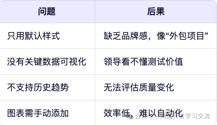
而一份专业的测试报告,应该像一份“产品简报”:
📊 数据清晰|🎨 设计美观|🔍 洞察明确|🚀 一键生成
🛠️ 终极方案:Allure + 自定义插件 + Python 脚本
我们通过三大招,让 Allure 报告“脱胎换骨”:
✅ 三步打造高颜值报告
美化界面:自定义主题与 Logo
增强数据:插入自定义图表(饼图、趋势图)
提升体验:添加环境信息、负责人、进度条
第一步:安装并配置 Allure
# 安装 Python allure-pytest
pip install allure-pytest
# 安装 Allure 命令行工具(用于生成报告)
# 下载地址:https://github.com/allure-framework/allure2
运行测试并生成原始报告:
pytest tests/ --alluredir=reports/allure_raw
allure serve reports/allure_raw  # 本地预览
第二步:美化界面(自定义 Logo 和 CSS)
✅ 创建自定义资源目录
reports/
├── allure_raw/          # 原始数据
├── custom/
│   ├── app.js           # 自定义 JS(可选)
│   ├── styles.css       # 自定义样式
│   └── logo.png         # 你的团队 Logo
✅ 编写 styles.css(让报告更“高级”)
/* reports/custom/styles.css */
/* 修改顶部导航栏 */
#navigation
 {
    background: linear-gradient(90deg,
#4A00E0
,
#8E2DE2
) !important;
    box-shadow: 0 4px 12px rgba(0,0,0,0.15);
}
/* 修改标题字体 */
.page-header__title {
    font-family: 'Helvetica Neue', Arial, sans-serif !important;
    font-weight: 600 !important;
    color:
#333
 !important;
}
/* 修改通过率颜色 */
.status_pie-chart {
    border: 2px solid
#f0f0f0
;
    border-radius: 12px;
    padding: 10px;
    background: white;
    box-shadow: 0 2px 8px rgba(0,0,0,0.08);
}
✅ 注入自定义资源
生成报告时注入:
allure generate reports/allure_raw \
        --clean \
        -o reports/html \
        --config ./allure.yml
创建 allure.yml 配置文件:
# allure.yml
web:
  headers:
    Content-Security-Policy: "default-src 'self'; script-src 'self' 'unsafe-inline'; style-src 'self' 'unsafe-inline';"
  resourceDirectories:
    - name: custom
      path: ./reports/custom
第三步:插入自定义图表(Python 脚本生成)
✅ 使用 allure.dynamic 添加图表
# conftest.py 或测试用例中
import allure
import json
from datetime import datetime
def attach_environment_info():
    """附加环境信息"""
    env_info = {
        "测试环境": "https://api.test.example.com",
        "部署版本": "v2.3.1-rc.2",
        "测试负责人": "张三",
        "执行时间": datetime.now().strftime("%Y-%m-%d %H:%M:%S")
    }
    allure.dynamic.environment(**env_info)
def attach_test_metrics():
    """附加测试指标图表"""
    # 模拟数据(实际可从数据库或历史记录读取)
    metrics = {
        "测试总数": 120,
        "通过": 112,
        "失败": 5,
        "跳过": 3
    }
    # 生成饼图 JSON
    pie_chart = {
        "labels": ["通过", "失败", "跳过"],
        "datasets": [{
            "data": [metrics["通过"], metrics["失败"], metrics["跳过"]],
            "backgroundColor": ["
#4CAF50
", "
#F44336
", "
#FF9800
"]
        }]
    }
    # 插入饼图
    allure.dynamic.description(
        f"""
        ## 📊 本次测试概览
        <div style="text-align:center; margin: 20px 0;">
            <canvas id="pieChart" width="400" height="300"></canvas>
        </div>
        <script src="https://cdn.jsdelivr.net/npm/chart.js"></script>
        <script>
        document.addEventListener('DOMContentLoaded', function() {{
            var ctx = document.getElementById('pieChart').getContext('2d');
            new Chart(ctx, {{
                type: 'pie',
                data: {json.dumps(pie_chart)},
                options: {{
                    responsive: true,
                    plugins: {{
                        legend: {{ position: 'bottom' }}
                    }}
                }}
            }});
        }});
        </script>
        """
    )
✅ 在 pytest 中调用
# test_sample.py
import pytest
import allure
@allure.epic("用户管理")
@allure.feature("登录模块")
class TestLogin:
    def setup_class(self):
        # 仅在类开始时添加一次
        attach_environment_info()
        attach_test_metrics()
    @allure.story("正常登录")
    def test_login_success(self):
        with allure.step("1. 发送登录请求"):
            # 模拟请求
            pass
        assert True
    @allure.story("密码错误")
    def test_login_wrong_password(self):
        assert False
第四步:添加趋势图(展示历史通过率)
✅ 生成趋势图(折线图)
def attach_trend_chart():
    """插入历史通过率趋势图"""
    # 模拟历史数据(实际可从 Jenkins、数据库获取)
    dates = ["10-01", "10-02", "10-03", "10-04", "10-05", "10-06", "10-07"]
    pass_rates = [85, 88, 82, 90, 92, 89, 94]  # 百分比
    trend_data = {
        "labels": dates,
        "datasets": [{
            "label": "通过率 (%)",
            "data": pass_rates,
            "borderColor": "
#4A00E0
",
            "backgroundColor": "rgba(74, 0, 224, 0.1)",
            "fill": True,
            "tension": 0.4
        }]
    }
    allure.dynamic.description(
        f"""
        ## 📈 质量趋势图
        <div style="text-align:center; margin: 20px 0;">
            <canvas id="trendChart" width="600" height="300"></canvas>
        </div>
        <script src="https://cdn.jsdelivr.net/npm/chart.js"></script>
        <script>
        document.addEventListener('DOMContentLoaded', function() {{
            var ctx = document.getElementById('trendChart').getContext('2d');
            new Chart(ctx, {{
                type: 'line',
                data: {json.dumps(trend_data)},
                options: {{
                    responsive: true,
                    plugins: {{
                        legend: {{ position: 'top' }}
                    }},
                    scales: {{
                        y: {{ min: 0, max: 100, title: {{ display: true, text: '通过率 (%)' }} }}
                    }}
                }}
            }});
        }});
        </script>
        """
)🧪 最终效果预览
你的 Allure 报告将拥有:
✅ 渐变色顶部导航栏
✅ 团队 Logo 显示
✅ 通过率饼图
✅ 历史趋势折线图
✅ 清晰的环境信息卡片
✅ 现代化字体与阴影
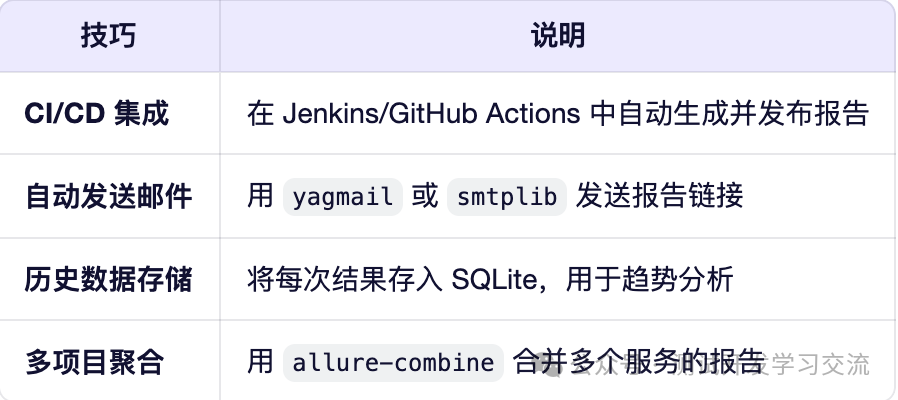
🌟 高级技巧
测试报告,是测试工程师的“门面担当”。
它不仅是执行结果的展示,更是测试价值的体现。
从今天开始,别再用“默认报告”交差,用这套方案打造:
🎨 高颜值|📊 强数据|🔍 深洞察 的专业报告
让你的测试工作,被看见、被认可、被重视!
📌 转发给团队,一起提升测试专业形象!
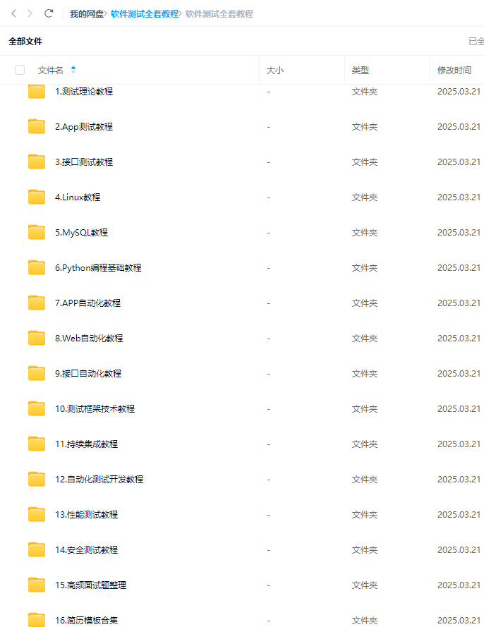
最后: 下方这份完整的软件测试视频教程已经整理上传完成,需要的朋友们可以自行领取【保证100%免费】

更多推荐
 18
18 0
0- 0


 已为社区贡献66条内容

所有评论(0)