
uniapp引入自定义modal框 弹出框
·
展示:
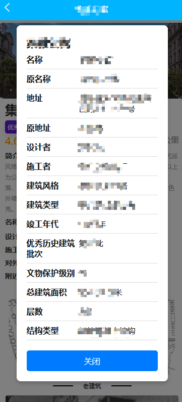
代码:
父文件:
<template>
  <view class="container">
    <!-- 点击文本 -->
    <text @tap="showModal('***公寓')">点击弹出框</text>

    <!-- 引入 Modal 组件 -->
    <Modal :title="modalTitle" :isVisible="isModalVisible" @update:isVisible="isModalVisible = $event" />
  </view>
</template>

<script>
// 引入 Modal 组件
import Modal from '@/components/Modal.vue';

export default {
  components: {
    Modal
  },
  data() {
    return {
      isModalVisible: false, // 控制弹出框显示
      modalTitle: '', // 弹出框标题
    };
  },
  methods: {
    // 显示弹出框
    showModal(title) {
      this.modalTitle = title; // 设置标题
      this.isModalVisible = true; // 显示弹出框
    }
  }
};
</script>

<style scoped>
.container {
  padding: 20px;
}

.text {
  font-size: 16px;
  color: #007bff;
  cursor: pointer;
}
</style>
modal组件文件:
<template>
  <view v-if="isVisible" class="modal" @tap="closeModal">
    <view class="modal-content" @tap.stop>
      <text class="modal-title">{{ title }}</text>
      <view class="modal-table">
        <view class="modal-table-row">
          <text class="modal-table-header">名称</text>
          <text class="modal-table-data">*****</text>
        </view>
        <view class="modal-table-row">
          <text class="modal-table-header">原名称</text>
          <text class="modal-table-data">*****</text>
        </view>
        <view class="modal-table-row">
          <text class="modal-table-header">地址</text>
          <text class="modal-table-data">*****</text>
        </view>
        <view class="modal-table-row">
          <text class="modal-table-header">原地址</text>
          <text class="modal-table-data">*****</text>
        </view>
        <view class="modal-table-row">
          <text class="modal-table-header">设计者</text>
          <text class="modal-table-data">*****</text>
        </view>
        <view class="modal-table-row">
          <text class="modal-table-header">施工者</text>
          <text class="modal-table-data">*****</text>
        </view>
        <view class="modal-table-row">
          <text class="modal-table-header">建筑风格</text>
          <text class="modal-table-data">现代主义风格</text>
        </view>
        <view class="modal-table-row">
          <text class="modal-table-header">建筑类型</text>
          <text class="modal-table-data">商住混合型公寓</text>
        </view>
        <view class="modal-table-row">
          <text class="modal-table-header">竣工年代</text>
          <text class="modal-table-data">1942年</text>
        </view>
        <view class="modal-table-row">
          <text class="modal-table-header">优秀历史建筑批次</text>
          <text class="modal-table-data">第四批</text>
        </view>
        <view class="modal-table-row">
          <text class="modal-table-header">文物保护级别</text>
          <text class="modal-table-data">无</text>
        </view>
        <view class="modal-table-row">
          <text class="modal-table-header">总建筑面积</text>
          <text class="modal-table-data">6506平方米</text>
        </view>
        <view class="modal-table-row">
          <text class="modal-table-header">层数</text>
          <text class="modal-table-data">7层</text>
        </view>
        <view class="modal-table-row">
          <text class="modal-table-header">结构类型</text>
          <text class="modal-table-data">钢筋混凝土结构</text>
        </view>
      </view>
      <view class="modal-close" @tap="closeModal">关闭</view>
    </view>
  </view>
</template>

<script>
export default {
  props: {
    title: {
      type: String,
      required: true
    },
    isVisible: {
      type: Boolean,
      required: true
    }
  },
  methods: {
    closeModal() {
      this.$emit('update:isVisible', false);  // 关闭modal
    }
  }
};
</script>

<style scoped>
.modal {
  position: fixed;
  top: 0;
  left: 0;
  right: 0;
  bottom: 0;
  background: rgba(0, 0, 0, 0.5);
  display: flex;
  justify-content: center;
  align-items: center;
}

.modal-content {
  background-color: white;
  width: 80%;
  max-width: 600px;
  padding: 20px;
  border-radius: 8px;
  box-shadow: 0 4px 8px rgba(0, 0, 0, 0.2);
}

.modal-title {
  font-size: 22px;
  font-weight: bold;
  margin-bottom: 15px;
  text-align: center;
}

.modal-table {
  width: 100%;
}

.modal-table-row {
  display: flex;
  justify-content: space-between;
  padding: 8px 0;
  border-bottom: 1px solid #ddd;
}

.modal-table-header {
  font-weight: bold;
  width: 40%;
}

.modal-table-data {
  width: 60%;
}

.modal-close {
  margin-top: 20px;
  text-align: center;
  background-color: #007bff;
  color: white;
  padding: 10px;
  border-radius: 5px;
  cursor: pointer;
}

.modal-close:hover {
  background-color: #0056b3;
}
</style>
更多推荐

 2
2 0
0- 0


 已为社区贡献15条内容

所有评论(0)