
【数据可视化实验-1】类别比较性数据可视化之柱形图
·
实验内容:
自选数据分别绘制单数据系列柱形图、多数据系列柱形图、堆积柱形
图和百分比柱形图。
实验要求:
自选类别比较型数据集,分别选取单数据系列数据和多数据系列数据。
实验目的:
理解类别比较型图表,熟练绘制柱形图。
from matplotlib import cm,colors
from matplotlib import pyplot as plt
from matplotlib.pyplot import figure, show, rc
import numpy as np
import pandas as pd
plt.rcParams["font.sans-serif"]='SimHei'
plt.rcParams['axes.unicode_minus']=False
plt.rc('axes',axisbelow=True)
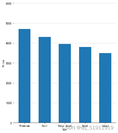
#单数据系列柱形图
mydata=pd.DataFrame({'Cut':["Fair","Good","Very Good","Premium","Ideal"], 'Price':[4300,3800,3950,4700,3500]})
Sort_data=mydata.sort_values(by='Price', ascending=False)
fig=plt.figure(figsize=(6,7),dpi=70)
plt.subplots_adjust(left=0.1, right=0.9, top=0.9, bottom=0.1)
plt.grid(axis="y",c=(217/256,217/256,217/256))
ax = plt.gca()
ax.spines['top'].set_color('none')
ax.spines['right'].set_color('none')
ax.spines['left'].set_color('none')
plt.bar(Sort_data['Cut'],Sort_data['Price'],width=0.6,align="center",label="Cut")
plt.ylim(0,6000)
plt.xlabel('Cut')
plt.ylabel('Price')
plt.savefig("单数据系列柱形图.jpg")
#双数据系列柱形图
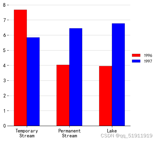
df=pd.read_csv('MultiColumn_Data.csv')
df=df.sort_values(by='1996', ascending=False)
x_label=np.array(df["Catergory"])
x=np.arange(len(x_label))
y1=np.array(df["1996"])
y2=np.array(df["1997"])
fig=plt.figure(figsize=(5,5))
plt.subplots_adjust(left=0.1, right=0.9, top=0.9, bottom=0.1)
plt.bar(x,y1,width=0.3,color='r',label='1996',edgecolor='k', linewidth=0.25)
plt.bar(x+0.3,y2,width=0.3,color='b',label='1997',edgecolor='k', linewidth=0.25)
plt.xticks(x+0.15,x_label,size=12)
plt.legend(loc=(1,0.5),ncol=1,frameon=False)
plt.yticks(size=12)
plt.grid(axis="y",c=(217/256,217/256,217/256))
ax = plt.gca()
ax.spines['top'].set_color('none')
ax.spines['right'].set_color('none')
ax.spines['left'].set_color('none')
plt.savefig("双数据系列柱形图.jpg")
#堆积柱形图
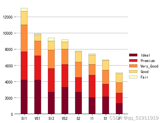
df=pd.read_csv('StackedColumn_Data.csv')
df=df.set_index("Clarity")
Sum_df=df.apply(lambda x: x.sum(), axis=0).sort_values(ascending=False)
df=df.loc[:,Sum_df.index]
meanRow_df=df.apply(lambda x: x.mean(), axis=1)
Sing_df=meanRow_df.sort_values(ascending=False).index
n_row,n_col=df.shape
x_value=np.arange(n_col)
cmap=cm.get_cmap('YlOrRd_r',n_row)
color=[colors.rgb2hex(cmap(i)[:3]) for i in range(cmap.N)]
bottom_y=np.zeros(n_col)
fig=plt.figure(figsize=(5,5))
for i in range(n_row):
    label=Sing_df[i]
    plt.bar(x_value,df.loc[label,:],bottom=bottom_y,width=0.5,color=color[i],label=label,edgecolor='k', linewidth=0.25)
    bottom_y=bottom_y+df.loc[label,:].values
plt.xticks(x_value,df.columns,size=10)
plt.legend(loc=(1,0.3),ncol=1,frameon=False)
plt.grid(axis="y",c=(166/256,166/256,166/256))
ax = plt.gca()
ax.spines['top'].set_color('none')
ax.spines['right'].set_color('none')
ax.spines['left'].set_color('none')
#百分比柱形图
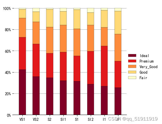
df=pd.read_csv('StackedColumn_Data.csv')
df=df.set_index("Clarity")
SumCol_df=df.apply(lambda x: x.sum(), axis=0)
df=df.apply(lambda x: x/SumCol_df, axis=1)
meanRow_df=df.apply(lambda x: x.mean(), axis=1)
Per_df=df.loc[meanRow_df.idxmax(),:].sort_values(ascending=False)
Sing_df=meanRow_df.sort_values(ascending=False).index
df=df.loc[:,Per_df.index]
n_row,n_col=df.shape
x_value=np.arange(n_col)
cmap=cm.get_cmap('YlOrRd_r',n_row)
color=[colors.rgb2hex(cmap(i)[:3]) for i in range(cmap.N) ]
bottom_y=np.zeros(n_col)
fig=plt.figure(figsize=(5,5))
for i in range(n_row):
    label=Sing_df[i]
    plt.bar(x_value,df.loc[label,:],bottom=bottom_y,width=0.5,color=color[i],label=label,edgecolor='k', linewidth=0.25)
    bottom_y=bottom_y+df.loc[label,:].values
plt.xticks(x_value,df.columns,size=10)
plt.gca().set_yticklabels(['{:.0f}%'.format(x*100) for x in plt.gca().get_yticks()])
plt.legend(loc=(1,0.3),ncol=1,frameon=False)
plt.grid(axis="y",c=(166/256,166/256,166/256))
ax = plt.gca()
ax.spines['top'].set_color('none')
ax.spines['right'].set_color('none')
ax.spines['left'].set_color('none')
更多推荐
 2
2 0
0- 0


 已为社区贡献1条内容

所有评论(0)