
Python数据可视化、五
一、绘制固定区域子图
matplotlib可以将整个画布规划成等分布局的mn(行列)的矩阵区域,并按照先行后列的·方式对每个区域进行编号(编号从1开始),之后在选中的某个区域或某些区域中绘制单个‘或多个子图。
(1)绘制单子图
使用pyplot的subplot()函数可以规划好的某个区域中绘制单个子图,subplot()函数的语法格式如下:
subplot(nrows,ncols,index,projection,polar,sharex,sharey,label,**kwargs)
例子:
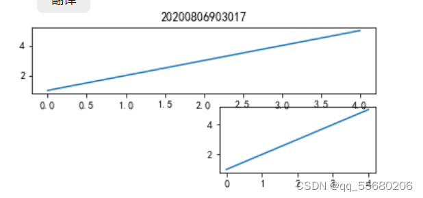
将画布规划成32的矩阵区域,并在索引为6的区域中绘制子图;再将画布规划成31的矩阵区域,并在索引为2的区域绘制子图,代码如下:
%matplotlib inline
import matplotlib.pyplot as plt
ax_one = plt.subplot(326)
ax_one.plot([1, 2, 3, 4, 5])
ax_two = plt.subplot(312)
ax_two.plot([1, 2, 3, 4, 5])
plt.title("20200806903017")
plt.show()
运行结果:
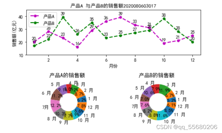
#实例某工厂A,B产品销售额分析、
代码如下:
%matplotlib inline
import numpy as np
import matplotlib.pyplot as plt
plt.rcParams['font.sans-serif'] = ["SimHei"]
x = [x for x in range(1, 13)]
y1 = [20, 28, 23, 16, 29, 36, 39, 33, 31, 19, 21, 25]
y2 = [17, 22, 39, 26, 35, 23, 25, 27, 29, 38, 28, 20]
labels = ['1 月', '2 月', '3 月', '4 月', '5 月', '6 月', '7月', '8 月', '9 月', '10 月', '11 月', '12 月']
ax1 = plt.subplot(211)
ax1.plot(x, y1, 'm--o', lw=2, ms=5, label='产品A')
ax1.plot(x, y2, 'g--o', lw=2, ms=5, label='产品B')
ax1.set_title("产品A 与产品B的销售额2020080603017", fontsize=11)
ax1.set_ylim(10, 45)
ax1.set_ylabel('销售额(亿元)')
ax1.set_xlabel('月份')
for xy1 in zip(x, y1):
    ax1.annotate("%s" % xy1[1], xy=xy1, xytext=(-5, 5), textcoords='offset points')
for xy2 in zip(x, y2):
    ax1.annotate("%s" % xy2[1], xy=xy2, xytext=(-5, 5), textcoords='offset points')
ax1.legend()
ax2 = plt.subplot(223)
ax2.pie(y1, radius=1, wedgeprops={'width':0.5}, labels=labels, autopct='%3.1f%%', pctdistance=0.75)
ax2.set_title('产品A的销售额 ')
ax3 = plt.subplot(224)
ax3.pie(y2, radius=1, wedgeprops={'width':0.5}, labels=labels,autopct='%3.1f%%', pctdistance=0.75)
ax3.set_title('产品B的销售额 ')
plt.tight_layout()
plt.show()
运行结果:
(2)、绘制多子图
使用pylot的subplots()函数可以在规划好的所有区域中一次绘制多个子图。subplots()函数的语法格式如下:
subplots(nrows=1,ncols=1,sharex=False,sharey=False,squeeze=True,
subplot_kw=None,gridspec_kw=None,**fig_kw)
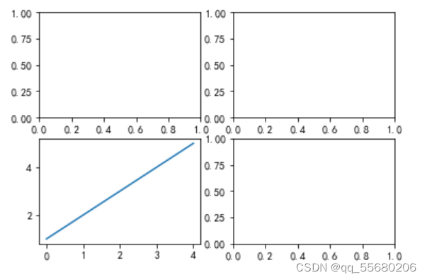
案例:将画布规划成2*2的矩形区域,之后在第3个区域中绘制子图,
代码如下:
%matplotlib inline
import matplotlib.pyplot as plt
fig, ax_arr = plt.subplots(2, 2)
ax_thr = ax_arr[1, 0]
ax_thr.plot([1, 2, 3, 4, 5])
运行结果:
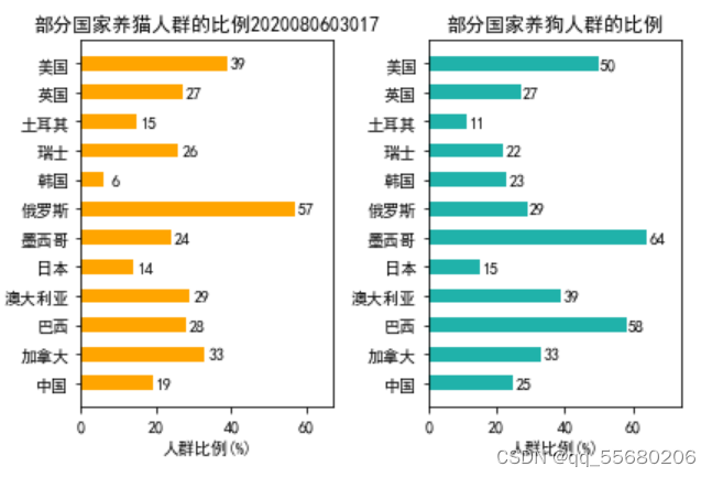
#实例养猫养狗人群比例分析
代码如下:
%matplotlib inline
import numpy as np
import matplotlib.pyplot as plt
plt.rcParams['font.sans-serif'] = ["SimHei"]
def autolabel(ax, rects):
    for rect in rects:
        width = rect.get_width()
        ax.text(width  + 3, rect.get_y() , s='{}'.format(width), ha='center', va='bottom')
y = np.arange(12)
x1 = np.array([19, 33, 28, 29, 14, 24, 57, 6, 26, 15, 27, 39])
x2 = np.array([25, 33, 58, 39, 15, 64, 29, 23, 22, 11, 27, 50])
labels = np.array(['中国', '加拿大', '巴西', '澳大利亚', '日本', '墨西哥',
                   '俄罗斯', '韩国', '瑞士', '土耳其', '英国', '美国'])
fig, (ax1, ax2) = plt.subplots(1, 2)
barh1_rects = ax1.barh(y, x1, height=0.5, tick_label=labels, color='#FFA500')
ax1.set_xlabel('人群比例(%)')
ax1.set_title('部分国家养猫人群的比例2020080603017')
ax1.set_xlim(0, x1.max() + 10)
autolabel(ax1, barh1_rects)
barh2_rects = ax2.barh(y, x2, height=0.5, tick_label=labels, color='#20B2AA')
ax2.set_xlabel('人群比例(%)')
ax2.set_title('部分国家养狗人群的比例')
ax2.set_xlim(0, x2.max() + 10)
autolabel(ax2, barh2_rects)
plt.tight_layout()
plt.show()
运行结果:
二、绘制自定义区域的子图
绘制单子图
使用pyplot的subplot2grid()函数将整个画布规划成非等分布局的区域,。并可在选中的某个区域绘制单个子图,subplot2grid()函数语法格式如下:
subplot2grid(shape,loc,rowspan=1,colspan=1,fig=None,**kwargs)
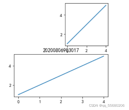
案例:将画布规划成2×3的矩阵区域,并在第0行第2列的区域中绘制子图;再次将画布规划成2×3的矩阵区域,并在第1-2列的区域中绘制子图,
代码如下:
%matplotlib inline
import matplotlib.pyplot as plt
ax1 = plt.subplot2grid((2, 3), (0, 2))
ax1.plot([1, 2, 3, 4, 5])
ax2 = plt.subplot2grid((2, 3), (1, 1), colspan=2)
ax2.plot([1, 2, 3, 4, 5])
plt.title("20200806903017")
plt.show()
运行结果:
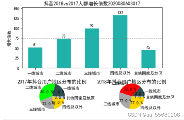
#实例:抖音用户分析
代码如下:
%matplotlib inline
import numpy as np
import matplotlib.pyplot as plt
plt.rcParams["font.sans-serif"] = ["SimHei"]
data_2017 = np.array([21, 35, 22, 19, 3])
data_2018 = np.array([13, 32, 27, 27, 1])
x = np.arange(5)
y = np.array([51, 73, 99, 132, 45])
labels = np.array(['一线城市', '二线城市', '三线城市', '四线及以外', '其他国家及地区'])
average = 75
bar_width = 0.5
def autolabel(ax, rects):
    for rect in rects:
        height = rect.get_height()
        ax.text(rect.get_x()  + bar_width/2, height + 3, s='{}'.format(height), ha='center', va='bottom')
ax_one = plt.subplot2grid((3,2), (0,0), rowspan=2, colspan=2)
bar_rects = ax_one.bar(x, y, tick_label=labels, color='#20B2AA', width=bar_width)
ax_one.set_title('抖音2018vs2017人群增长倍数2020080603017')
ax_one.set_ylabel('增长倍数')
autolabel(ax_one, bar_rects)
ax_one.set_ylim(0, y.max() + 20)
ax_one.axhline(y=75, linestyle='--', linewidth=1, color='gray')
ax_two = plt.subplot2grid((3,2), (2,0))
ax_two.pie(data_2017, radius=1.5, labels=labels, autopct='%3.1f %%',
           colors=['#2F4F4F', '#00FF00', '#A9A9A9', '#FFD700', '#B0C4DE'])
ax_two.set_title('2017年抖音用户地区分布的比例')
ax_thr = plt.subplot2grid((3,2), (2,1))
ax_thr.pie(data_2018, radius=1.5, labels=labels, autopct='%3.1f %%',
           colors=['#2F4F4F', '#FF0000', '#A9A9A9', '#FFD700', '#B0C4DE' ])
ax_thr.set_title('2018年抖音用户地区分布的比例')
plt.tight_layout()
plt.show()
运行结果:
三、共享子图的坐标轴
在同一画布中,若子图与其他子图的同方向的坐标轴相同,则可以共享子图之间同方向的坐标轴。下面将对相邻和非相邻子图之间共亭坐标轴的方式进行详细介绍。
(1)共享相邻子图的坐标轴,
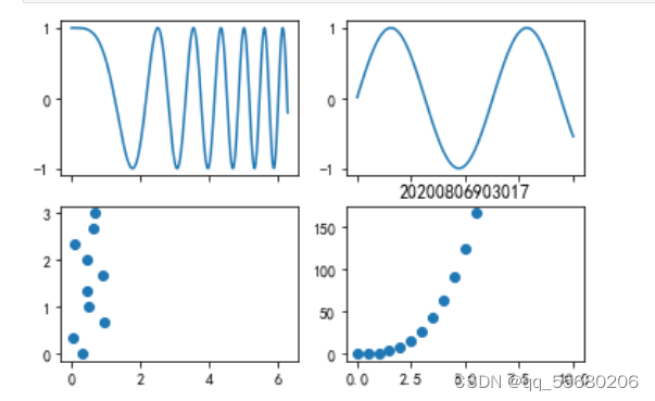
案例:将画布规划成2×2的矩阵区域,依次在每个区域中绘制子图,每一列子图之间共享x轴,示例代码如下:
%matplotlib inline
import numpy as np
import matplotlib.pyplot as plt
plt.rcParams['axes.unicode_minus'] = False
x1 = np.linspace(0, 2 *np.pi, 400)
x2 = np.linspace(0.01, 10, 100)
x3 = np.random.rand(10)
x4 = np.arange(0,6,0.5)
y1 = np.cos(x1 ** 2)
y2 = np.sin(x2)
y3 = np.linspace(0,3,10)
y4 = np.power(x4,3)
fig, ax_arr = plt.subplots(2, 2, sharex='col')
ax1 = ax_arr[0, 0]
ax1.plot(x1, y1)
ax2 = ax_arr[0, 1]
ax2.plot(x2, y2)
ax3 = ax_arr[1, 0]
ax3.scatter(x3, y3)
ax4 = ax_arr[1, 1]
ax4.scatter(x4, y4)
plt.title("20200806903017")
plt.show()
运行结果:
(2)共享非相邻子图的坐标轴
当pyplot 使用subplot0 函数绘制于图时,也可以将代表其他子图的变量赋值给 sharex 或sharey 参效,此时可以共享非相邻子图之间的坐标轴。
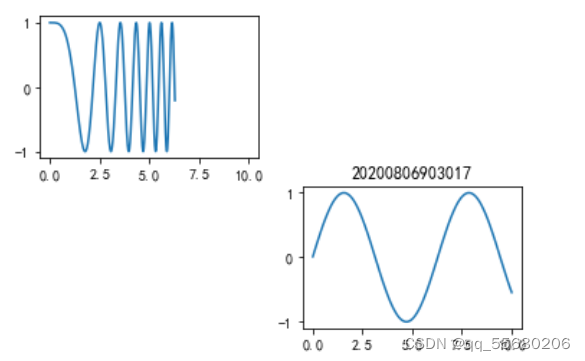
案例:将画布规划成 2x2 的矩阵区域之后在索引为 1的区域中先绘制一个子图,再次将画布规划成2x2的矩阵区域,之后在索引为 4 的区域中绘制另一个子图,后绘制的子图与先绘制的子图之间共享x轴,
代码如下:
%matplotlib inline
x1 = np.linspace(0, 2 *np.pi, 400)
y1 = np.cos(x1 ** 2)
x2 = np.linspace(0.01, 10, 100)
y2 = np.sin(x2)
ax_one = plt.subplot(221)
ax_one.plot(x1, y1)
ax_two = plt.subplot(224, sharex=ax_one)
ax_two.plot(x2, y2)
plt.title("20200806903017")
运行结果:
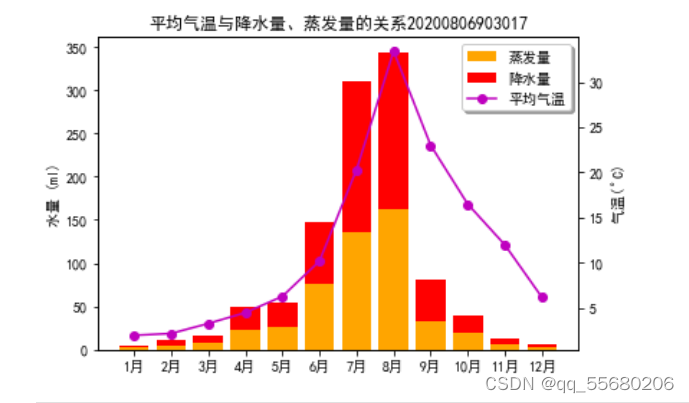
#实例:某地区全年平均气温与降水量,蒸发量的关系
代码如下:
%matplotlib inline
import numpy as np
import matplotlib.pyplot as plt
plt.rcParams["font.sans-serif"] = ["SimHei"]
plt.rcParams["axes.unicode_minus"] = False
month_x = np.arange(1, 13, 1)
data_tem = np.array([2.0, 2.2, 3.3, 4.5, 6.3, 10.2,
                     20.3, 33.4, 23.0, 16.5, 12.0, 6.2])
data_precipitation = np.array([2.6, 5.9, 9.0, 26.4, 28.7, 70.7,
                               175.6, 182.2, 48.7, 18.8, 6.0, 2.3])
data_evaporation = np.array([2.0, 4.9, 7.0, 23.2, 25.6, 76.7,
                             135.6, 162.2, 32.6, 20.0, 6.4, 3.3])
fig, ax = plt.subplots()
bar_ev = ax.bar(month_x, data_evaporation, color='orange', tick_label=['1月', '2月', '3月', '4月', '5月', '6月',
                                                                       '7月', '8月', '9月', '10月', '11月', '12月'])
bar_pre = ax.bar(month_x, data_precipitation, bottom=data_evaporation, color='red')
ax.set_ylabel('水量 (ml)')
ax.set_title('平均气温与降水量、蒸发量的关系20200806903017')
ax_right = ax.twinx()
line = ax_right.plot(month_x, data_tem, 'o-m')
ax_right.set_ylabel('气温($^\\circ$C)')
plt.legend([bar_ev, bar_pre, line[0]], ['蒸发量', '降水量', '平均气温'],
           shadow=True, fancybox=True)
plt.show()
运行结果:
四、子图的布局
当带有标题的多个子图并排显示时,多个子图会因区域过于紧凑而出现标题和坐标轴之间相互重叠的问题,而且子图元素的摆放过于紧凑
也影响用户的正常查看。matplotib 中提供了调整子图布局的方法,包括约束布局紧密布局和自定义布局通过这些方法可以合理布局多个子图。下面将对子图的布局方法进行详细介绍。
(1)约束布局
约束布局是指通过一系列限制来确定画布中元素的位置的方式,它预先会确定一个元素的绝对定位,之后以该元素的位置为基点对其他元素进行绝对定位,从而灵活地调整元素的位置。
matplolib 在绘制多子图时默认并未启用约束布局,它提供了两种方式启用约束布局:第
一种方式是使用 subplots0或figure()函数的
constrained_layout 参数;第二种方式是修改figure.constrained_layout.use 配置项。具体内容如下。
(1)使用constrained_layout 参数
maplotlib 使用subplots0或figure0 函数创建子图或画布时,可以将 constrained_Layout参数的值设为True,进而调整子图元素的布局,示例代码如下:
plt.subplots(constrained_layout=True)
(2)修改 figure.constrained_ layout.use 配置项
matplotlib 可以通过rcParams 宇典或rc()函数修改 figure.constrained_ layout. use 配置项的值为 True,进而调整子图元素的布局,
示例代码如下:
plt.rcParams['figure.constrained_ layout. use']=True
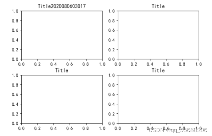
案例使用subplots()函数绘制2行2列的带有坐标轴的子图,并通过subplots()函数的constrained_layout参数启动约束布局,解决子图之间标签重叠的问题,
代码如下:
%matplotlib inline
import matplotlib.pyplot as plt
fig, axs = plt.subplots(2, 2, constrained_layout=True)
ax_one = axs[0, 0]
ax_one.set_title('Title2020080603017')
ax_two = axs[0, 1]
ax_two.set_title('Title')
ax_thr = axs[1, 0]
ax_thr.set_title('Title')
ax_fou = axs[1, 1]
ax_fou.set_title('Title')
plt.show()
运行结果:
(2)紧密布局
matiplotib 中紧密布局与约束布局相似,它采用紧凑的形式将子图排列到画布中,仅适用
于刻度标签、标轴标签和标题位置的调整。
pyplot 中提供了两种实现紧密布局的方式:第一种方式是调用 tight_layout()函数;第二种方式是修改 figure.autolayoutrcParam 配置项。关于紧密布局的两种实现方式的介绍如下
(1)调用 tight_layout() 函数
matplotlib 在 1.1版本中引入了tight_layout() 函数,通过该函数调整子图的内边距及子图
的间隙,使子图能适应画布的绘图区域。tight_ layout() 两数的语法格式如下
tight_layout(pad=1.08,h_pad=None,w_pad=None,rect=None)
(2)修改figure.autolayoutrcParam 配置项
pyplor可以通过rcParams 字典或rc()函数修改figure.autolayoutrcParam 配置项的值为
True,使子图元素适应画布,示例代码如下:
plt.rcParams['figure.autolayoutrcParam']=True
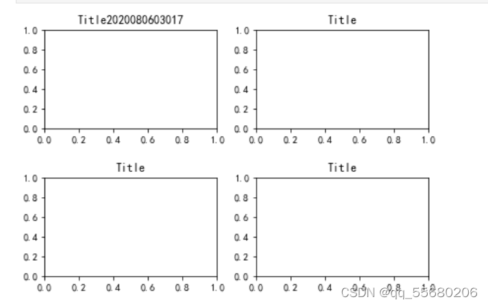
案例,代码如下:
%matplotlib inline
import matplotlib.pyplot as plt
fig, axs = plt.subplots(2, 2)
ax_one = axs[0, 0]
ax_one.set_title('Title2020080603017')
ax_two = axs[0, 1]
ax_two.set_title('Title')
ax_thr = axs[1, 0]
ax_thr.set_title('Title')
ax_fou = axs[1, 1]
ax_fou.set_title('Title')
plt.tight_layout(pad=0.4, w_pad=0.5, h_pad=2)
plt.show()
运行结果:
import matplotlib.pyplot as plt
fig, axs = plt.subplots(2, 2)
ax_one = axs[0, 0]
ax_one.set_title('Title52')
ax_two = axs[0, 1]
ax_two.set_title('Title52')
ax_thr = axs[1, 0]
ax_thr.set_title('Title52')
ax_fou = axs[1, 1]
ax_fou.set_title('Title52')
# 调整子图之间的距离
plt.tight_layout(pad=0.4, w_pad=0.5, h_pad=2)
plt.show()
运行结果:
(3) 自定义布局
GridSpec类的构造方法的语法格式如下:
GridSpec(nrows,ncols,figure=None,bottom+None,right=None,top=None,wspace=None,hspace=None,width_ratios=None,heught_ratios=None)
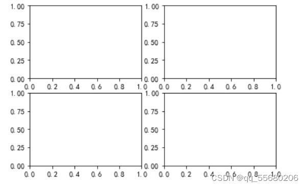
(1)使用GridSpec()方法创建子图的布局结构
具体示例代码如下:
import matplotlib.pyplot as plt
import matplotlib.gridspec as gridspec
fig2 = plt.figure()
spec2 = gridspec.GridSpec(ncols=2, nrows=2, figure=fig2)
f2_ax1 = fig2.add_subplot(spec2[0, 0])
f2_ax2 = fig2.add_subplot(spec2[0, 1])
f2_ax3 = fig2.add_subplot(spec2[1, 0])
f2_ax4 = fig2.add_subplot(spec2[1, 1])
plt.show()
运行结果;
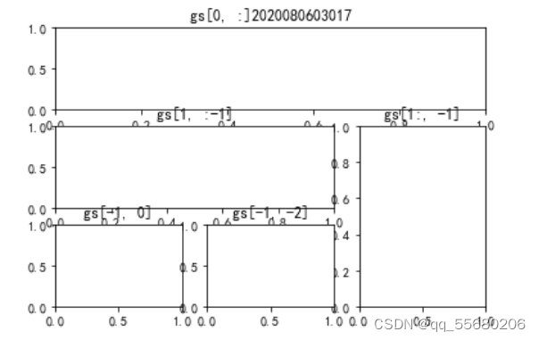
(2)使用add_gridspec()方法向画布添加布局结构
具体示例代码如下:
fig3 = plt.figure()
gs = fig3.add_gridspec(3, 3)
f3_ax1 = fig3.add_subplot(gs[0, :])
f3_ax1.set_title('gs[0, :]2020080603017')
f3_ax2 = fig3.add_subplot(gs[1, :-1])
f3_ax2.set_title('gs[1, :-1]')
f3_ax3 = fig3.add_subplot(gs[1:, -1])
f3_ax3.set_title('gs[1:, -1]')
f3_ax4 = fig3.add_subplot(gs[-1, 0])
f3_ax4.set_title('gs[-1, 0]')
f3_ax5 = fig3.add_subplot(gs[-1, -2])
f3_ax5.set_title('gs[-1, -2]')
运行结果:
#实例:某品牌汽车销售情况
import numpy as np
import matplotlib.pyplot as plt
import matplotlib.gridspec as gridspec
plt.rcParams["font.sans-serif"] = ["SimHei"]
x_month = np.array(['1月', '2月', '3月', '4月', '5月', '6月'])
y_sales = np.array([2150, 1050, 1560, 1480, 1530, 1490])
x_citys = np.array(['北京', '上海', '广州', '深圳', '浙江', '山东'])
y_sale_count = np.array([83775, 62860, 59176, 64205, 48671, 39968])
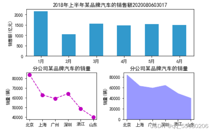
fig = plt.figure(constrained_layout=True)
gs = fig.add_gridspec(2, 2)
ax_one = fig.add_subplot(gs[0, :])
ax_two = fig.add_subplot(gs[1, 0])
ax_thr = fig.add_subplot(gs[1, 1])
ax_one.bar(x_month, y_sales, width=0.5, color='#3299CC')
ax_one.set_title('2018年上半年某品牌汽车的销售额2020080603017')
ax_one.set_ylabel('销售额(亿元)')
ax_two.plot(x_citys, y_sale_count, 'm--o', ms=8)
ax_two.set_title('分公司某品牌汽车的销量')
ax_two.set_ylabel('销量(辆)')
ax_thr.stackplot(x_citys, y_sale_count, color='#9999FF')
ax_thr.set_title('分公司某品牌汽车的销量')
ax_thr.set_ylabel('销量(辆)')
plt.show()
运行结果:
更多推荐



 1
1 0
0- 0


 已为社区贡献1条内容

所有评论(0)