
使用uniapp实现一个简单的上(固定)中(滚动)下(固定)布局
·
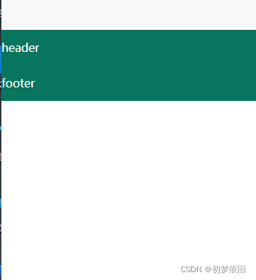
这是我当前的uniapp,中间的内容直接就没有了,现在开始解决问题
中间的内容没有高度给他设置了高度之后就可以了,附上源码,直接考过来就可以使用的
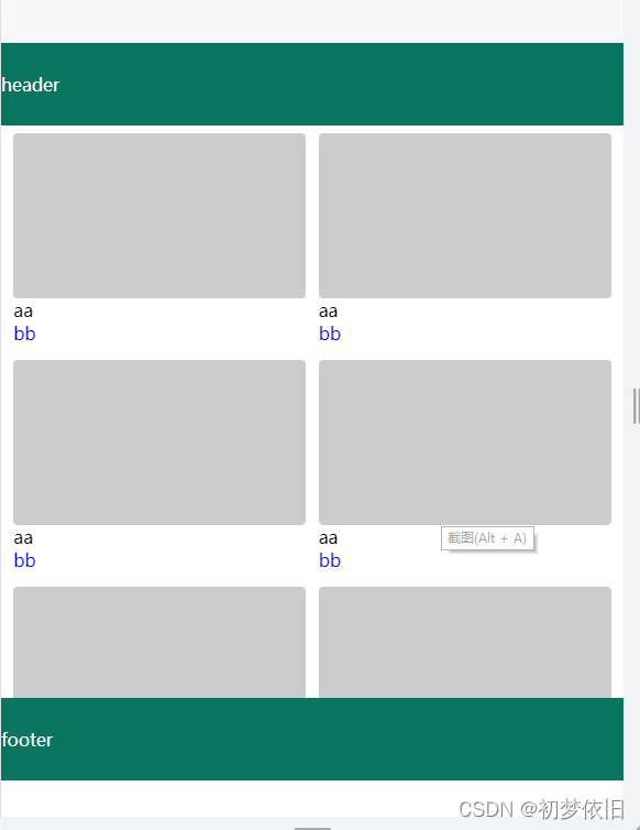
效果图是这样的,高度拉一下,就可以滚动了,并且头部和底部是固定的
<template>
	<view class="page">
		<view class='wraper'>
			<view class='header'>header</view>
			<view class='main'>
				<scroll-view class='main-scroll' scroll-y style="height: 100%">
					<view class='main-list'>
						<view class='card' v-for="(item,index) in cardList">
							<view class='card-box'></view>
							<view>{{item.name}}</view>
							<view class='card-content'>{{item.content}}</view>
						</view>
					</view>
				</scroll-view>
			</view>
			<view class='footer'>footer</view>
		</view>
	</view>
</template>

<script>
	export default {
		data() {
			return {
				cardList: [{
					name: 'aa',
					content: 'bb'
				}, {
					name: 'aa',
					content: 'bb'
				}, {
				 name: 'aa',
					content: 'bb'
				}, {
					name: 'aa',
					content: 'bb'
				}, {
					name: 'aa',
					content: 'bb'
				}, {
					name: 'aa',
					content: 'bb'
				}, {
					name: 'aa',
					content: 'bb'
				}, {
					name: 'aa',
					content: 'bb'
				}, ]
			}
		},
		methods: {

		}
	}
</script>

<style>
	.page {
		width: 100%;
		height: 100%;
	}
	.wraper {
		display: flex;
		flex-direction: column;
		width: 100%;
		height: 100%;
	}

	.header {
		background: rgb(8, 117, 94);
		color: #fff;
		line-height: 100rpx;
		flex: 0 0 100rpx;
		/* 不放大不缩小固定100rpx */
	}

	.main {
		height: 690rpx;
		position: relative;
	}

	.main-scroll {
		position: absolute;
		left: 0;
		right: 0;
		top: 0;
		bottom: 0;
	}

	.main-list {
		display: flex;
		flex-wrap: wrap;
		justify-content: space-between;
		margin-left: 2vw;
		margin-right: 2vw;
	}

	.card {
		width: 47vw;
		margin-top: 10rpx;
		margin-bottom: 10rpx;
	}

	.card-box {
		width: 100%;
		height: 200rpx;
		border-radius: 6rpx;
		background: #ccc;
	}

	.card-content {
		color: blue;
	}

	.footer {
		background: rgb(8, 117, 94);
		color: #fff;
		line-height: 100rpx;
		flex: 0 0 100rpx;

	}
</style>
更多推荐


 1
1 0
0- 0


 已为社区贡献1条内容

所有评论(0)